I was lucky enough to attend an Edward Tufte workshop last month,and had a meeting today with one of the archivists at my library to discuss it. It reminded me about several things that were great about it.
- Sparklines are probably the number one best takeaway. They are basically graphic images that get embedded into the text. You have probably seen more of these than you think–for example, they are used in this financial report from Yahoo. So, instead of having one data point, you basically have a whole lot of information coming to you at once, so you can put one data point into context. Apparently, there is now a TrueType font available, but I haven’t tried it. Doing a Google Image search for sparklines yields a lot of interesting examples.
- One of the most beautiful examples of design dates way back to Saturn images in Galileo’s text .
- The books! Edward Tufte’s books are beautiful.
- Never do powerpoint again. Do written reports that get handed out ahead of time. Tufte has an interesting article on Lousy PowerPoint presentations. Also, he has done work on conveying technical information in powerpoints, and how NASA had relied heavily on powerpoints during the Challenger days. This is fascinating, and sad days in scientific communication.
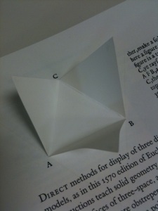
- Tufte has an amazing book collection. At one point he pulled out a personal copy of Euclid’s Geometry (1570) He noted that his copy was previously owned by Shakespeare’s contemporaneous playwright, Ben Jonson. This is the oldest pop-up book I have ever seen: three flaps of triangular paper come together in a 3-D point, to form a tiny pyramid. Tufte reprints an identical pop-up over 400 years later in Envisioning Information, on page 16.

It has been a beautiful data kind of day! I just ran across a story in Computerworld that has a great listing of 22 free tools for data visualization. And, Lauren Meyers, in our archive, just sent me this cool link to Victorian Infographics!
So, we are brainstorming around the library about how to make beautiful data, and mining the archives for some lovely examples of 3-D design in Euclid books, and old maps. We’ll let you know what we find!
Additonal note 5/5/2011: I had forgotten to mention anything about the Galileo sunspot animation. Tufte showed a film that one of his students had produced. In a similar effort, Rice’s Galileo Project had done short animations of the daily sunspot observations that Galileo had done in 1612. Really brilliant.

Great post Debra. The links are very informative. Sparklines are a great idea, though I doubt that journal editors will tolerate them. Still, they can be very effective in books and web sites.